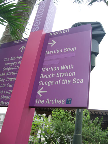
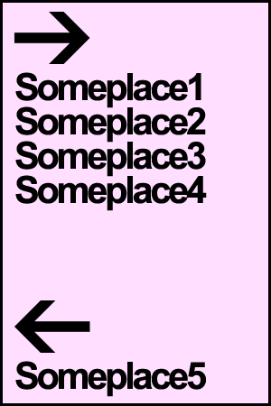
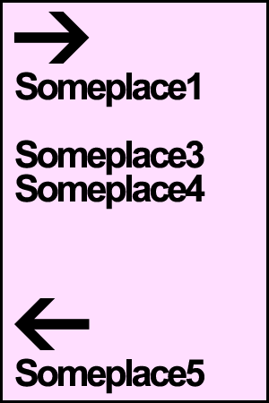
And it matters a lot. On the first glance, would you go left or right, if you wanted to go to “Songs of the Sea”?

Look at it again. This signboard gave me a good 30 minutes workout in Sentosa, walking lost in the Merlion Park!
If they’ve used whitespace well in their initial design, things would have been so much easier on the glance.

even if something is amiss, we can see it immediately.

Are you using whitespace effectively in your web design?

white space is indeed very important.
I think whoever designed that signage is being ‘too smart’.
hahaa.. no lar, maybe the intention was to get people running around merlion park 😀 then when tourists go back home then got story to tell mah.
@Tim I thought the person who did it is plain lazy or… is it the authority (be it STB or Sentosa Leisure Group or LTA) is too stingy to change a new signage.
Luckily no so many tourists coming to Singapore recently and the problem better get fixed quickly or else Singapore efficient image might be tarnished.
They might have planned for white space in the beginning, but later added in the ‘newer’ attractions (such as Songs of the Sea, and CineBlast) on the sign, so as to save up on planting a new signage altogether.
*Note the ‘overflow of text’ on the board on the left.
Have you observed this problem throughout the island, or was it just this one?
Why blog about it? How ’bout being a lil more proactive and send your comments and a photo of the signage to Sentosa Leisure Group?
Here’s the link if you’re too lazy to google for it: http://www.sentosa.com.sg/about_us/contactus.html
Bloggers. *Sigh. Are so 2006.