Three Column Layouts with CSS

Yesterday I re-watched a module in the StomperNet STSE2 video course, and Leslie Rhodie was recommending this optimized 3 column CSS layout.

Optimizing your page HTML order is very important for SEO, to provide search engines the unique content of every page first. This means that if the spiders from the different search engines have a limited amount of time on your site, they will get the unique content of the page first.

I think it is an excellent resource. Great work Matthew.

Wanna be an SEO Service Provider?

I read this on SEO Book this morning about being an SEO service provider and it makes sense:

Here is why I think some of you might be selling yourself short if you sell your hard won skills to clients.

If you can return real value to clients i.e. not just ranking and traffic, but real tangible, value – then why aren't you keeping all that value for yourself? Why not compete with them instead? How about partnering with people so you get to keep an on-going share of their business? If you can position sites in lucrative keyword areas, that is a very valuable skill. Can clients even afford to pay what you're really worth?

If you’re really good at SEO, do you really need clients? 😉

I can fully relate to this – partnering with people to get an ongoing share of their business. But in real life, its not easy. For example, if you were partnering with an SEO provider for your business selling rubber stamps, how do you decide that “oh this stamp is sold because of SEO… and this one is not?”.

Many businesses want to keep their business within themselves. They’d prefer the idea of “outsource” instead of “partnership”.

… and yes, as much as anyone is skilled in SEO, they will need to work with other people for knowledge in the particular niche. Of all the “people”, clients pay best because they are “business transactions”.

What do you think?

Google SEO Guide for Starters From the Horse’s Mouth

I mean from the Google webmaster central blog, free.

The 22 page Google SEO guide is what it is – for starters.

But on the other hand, I’ll also say that its packed with what is essential for your site to perform on Google. If you just stick to the concepts illustrated in pages 2 to 19 on the guide as your bible, then you site is practically honey to the GoogleBot bee (it doesn’t sound very nice to say your site is a “fat fly to the GoogleBot Spider” right? :mrgreen: )

Page 20 is a one page writeup about the principles behind off page optimization – or how you should promote your site.

I’d highlight the “avoids” because I think these are important:

Avoid:
attempting to promote each new, small piece of content you create; go for big, interesting items
involving your site in schemes where your content is artificially promoted to the top of these services

Avoid:
spamming link requests out to all sites related to your topic area
purchasing links from another site with the aim of getting PageRank instead of traffic

Go grab the SEO guide and read it now!

StomperNet’s STSE2 is a load of CRAP

Okay, I might probably be the last one in the whole wide world to complete watching StomperNet’s Stomping the Search Engines (STSE2) video course which Andy Jenkins, Brad Fallon and team gave out for free two months ago.

Stomping the Search Engines 2

But frankly… my thoughts… This whole package is a big load of CRAP! In fact, I’d say that this is the most awesome piece of CRAP I’ve ever watched!

Heh. Don’t shut me off. CRAP is a good thing! Let me explain.

C – It’s Complete!

It covers all the essential topics for a online business owner to dominate the search engines, right from the start about why SEO, and the SEO mindset (I love that one!), all the way until how to measure and track your progress!

R – It provides Real Life Examples!

Unlike many other courses you get for $47, $67 or $97 which provide a lot of theory and vague examples, Andy showcased two of his real-life sites in the slides, and frankly, for me, that helped so much because I know one of the best ways to learn is to analyse successful sites and mimick their site structure!

And yes, like I’ve always emphasised – if you are looking for “guru” to follow, look for one with success not only in the Internet marketing niche. The StomperNet faculty members have definitely done that!

A – It’s packed with Actionable steps!

In the modules on keyword concepts, site structure, on page optimization, off page optimization and measuring and testing. Many of the points are very action focused! This means you can just take that point and go make changes to your site!

In fact, I could have gone through that 7 modules quickly and dumped it into my digital junkyard.

But what really intrigued me was the really practical steps to take. I resolved that I had to relisten to some modules over and over and I even bought a notebook to take notes on the action steps to implement! I have 22 pages of notes! Some of the concepts have already been implemented on this blog!

P – It’s awesomely (is there such a word?) Practical!

I think its a VERY practical package for web designers, online marketers, and online business owners – to immediately take their websites on to the next level. I like it that its delivered on a CD-rom, as opposed to delivered online – which many marketers do.

This allows me to view the videos even while I was on the train back home. With the CD, I know that the content will be there all the time when I need it… and I’m confident that I’ll return to it as a reference within the next year!

If you haven’t got the package, too bad. The StomperNet guys are closed to handle some order fulfillment issues at the moment.

But get on their mailing list and wait. Its worthwhile. You’ve GOT to get your hands on this.

One Drawback

I’ve to admit, there is one drawback to the package. I think this video course is perfect for people like myself. I’m trained in computing, and I had to replay some of the segments to fully absorb what the speaker was putting across.

In other words, the non tech-savvy people might take a longer time, and would definitely require some help in getting the tasks done. But that’s not new – SEO is grunt work at times, and it can be technical.

If you are in that situation, think of “how can I get this done?” rather than “should I do this?”. There are lots of great technical people behind elance.com waiting for projects, so feed them! 🙂 … Or you can feed me too! :mrgreen:

Great work, StomperNet!

SITEX Singapore Website Review

Heh, I hate to say this, but I think the organizers of SITEX can afford to put together a better website.

But before, I go on, check out the SITEX site for just 10 seconds. Tell me – what is the FIRST thing you notice?

Got it? Good.

Did you notice “Your Digital Playground” first?

Wow! I can read you mind? Yeah, this is me, inside your computer, looking at where your eyes looked at. :mrgreen:

Heh. Not so. It’s all about web usability.

Currently, the website looks like this:

sitex-2008-homepage

Looking at the Adsense ad placement heat map, which is recommended by Google after going thru testing by their scientists, we know that the most attention always go to the middle of the page.

Unfortunately for the SITEX site, all its put there is a big image with “Your Digital Playground”… and buttons to the different segments. (yes, those green bordered circles with icons are buttons – didn’t you have the slightest idea?)

Frankly, I feel “Your Digital Playground” doesn’t help me much for a surfer. If I am a consumer, I want to know four things – dates, locations, opening timings and great deals. (Or maybe Job Opportunities if I wanna be a sales promoter for the event!) If I am a exhibitor or advertiser, I want to know the PR opportunities, rates, and exposure.

“Your Digital Playground” doesn’t tell me any information about what I want to know. The consumer targeted information is located the top left, where you logo should have been, and the link to details regarding advertising opportunities is at the middle of the header, not to mention, in small white print over the red star (or whatever you call it!)

So, how Kian Ann?

I’d recommend it look something like this!

Well, this is just a 3 min revamp of the layout so obviously the colors need more tweaking, but you get the idea – in terms of the placements of the elements.

sitex-website-revamped

Five Useful Usability Adjustments

Here are five usability adjustments to create a better user experience!

  1. Shift the elements in order, give the consumers and advertisers to find what they want, faster. Put important elements smack at the middle.
  2. Make buttons look like buttons please! I’m sorry, but 14 round circles with irritating mouse-overs DON’T work well. (You can probably go ahead and track how many clicks go through them!) Accompany them with text, so people know that the buttons mean without having to mouse-over the button.
  3. Exhibitors Lounge, Visitors Lounge, Media Lounge… cut out the lounge. Make the menu items shorter.
  4. Move the opt-in form to the left, or together with your content!
  5. Make it obvious where to go to advertise at SITEX. “Check out! Special SITEX supplements” don’t tell me about PR and advertising opportunities.

Now, on to Search Engine Optimization!

I’m going to talk primarily on On Page SEO – their off page optimization is naturally good since it is the main website for a very popular event in Singapore, and they do a lot of offline marketing and advertising, resulting in quite a heapful of incoming links from the advertisers and the different reviews and user experiences over the years.

Because of the link juice, its a PR5 site!

Let’s dive in to the On Page SEO killers.

#1. The first link on the site is called “Home”.

In SEO, the anchor text is critically important for link reputation. If so I want to rank well for “blog marketing” for example, I’d put blog marketing as the link anchor text.

My recommendation: Change it to “SITEX”.

#2. Linking to index.html!

The home link links to “index.html”. There are two drawbacks. First, it will not be easy for them to switch to a server site script in the future (e.g. change to index.php, or index.asp). Redirection is needed to not lose the visitors… and this falls into a duplicate content trap. (i.e. http://www.sitex.com.sg and http://www.sitex.com.sg/index.html) are treated as two different pages.

My recommendation: cut the index.html in the link.

#3. Canonical Domains Issues!

The website does not redirect the “www” version to the “non-www” version of the site, or vice versa. In SEO, http://www.sitex.com.sg and http://sitex.com.sg are two different sites. This, again, might trigger duplicate content penalties.

My recommendation: use a redirect to one version, and keep to the version. (I’d recommend the version with the WWW)

#4. Weak Content!

The page looks beautiful filled with colors, but with some content and keyword density analysis, you will notice that there are only 132 words in the whole first page! Less than this blog post! Heh. Content is king. Add more content.

On keyword density, guess what? “Home” appears 5 times and is the top keyword! Disastrous!

My recommendation: add more content, and add keyword rich content relevant to the event!

#5. Same Page Titles Throughout the Site!

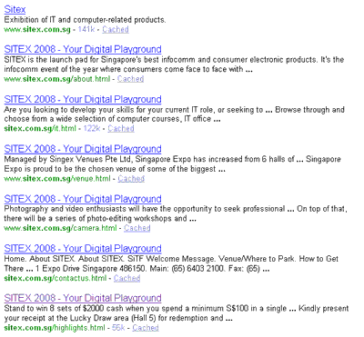
If you look at the indexed pages, you will find that the site has 214 pages… all with the same title!

seo-same-page-titles

Like how my SEO mentor loves to put it, imagine your site as a hotel. Having same titles for every page would be equivalent to having every door in the hotel with the same unit number! How do you expect the search engines to categorise and index your content correctly?

My recommendation: Go work on those titles – make them unique to each page!

That’s It!

Yes, so, 5 usability recommendations and 5 SEO recommendations, that I can guarantee will improve their rankings, web traffic and conversions.