Heh, I hate to say this, but I think the organizers of SITEX can afford to put together a better website.
But before, I go on, check out the SITEX site for just 10 seconds. Tell me – what is the FIRST thing you notice?
Got it? Good.
Did you notice “Your Digital Playground” first?
Wow! I can read you mind? Yeah, this is me, inside your computer, looking at where your eyes looked at. 
Heh. Not so. It’s all about web usability.
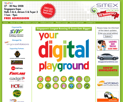
Currently, the website looks like this:

Looking at the Adsense ad placement heat map, which is recommended by Google after going thru testing by their scientists, we know that the most attention always go to the middle of the page.
Unfortunately for the SITEX site, all its put there is a big image with “Your Digital Playground”… and buttons to the different segments. (yes, those green bordered circles with icons are buttons – didn’t you have the slightest idea?)
Frankly, I feel “Your Digital Playground” doesn’t help me much for a surfer. If I am a consumer, I want to know four things – dates, locations, opening timings and great deals. (Or maybe Job Opportunities if I wanna be a sales promoter for the event!) If I am a exhibitor or advertiser, I want to know the PR opportunities, rates, and exposure.
“Your Digital Playground” doesn’t tell me any information about what I want to know. The consumer targeted information is located the top left, where you logo should have been, and the link to details regarding advertising opportunities is at the middle of the header, not to mention, in small white print over the red star (or whatever you call it!)
So, how Kian Ann?
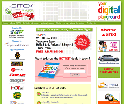
I’d recommend it look something like this!
Well, this is just a 3 min revamp of the layout so obviously the colors need more tweaking, but you get the idea – in terms of the placements of the elements.

Five Useful Usability Adjustments
Here are five usability adjustments to create a better user experience!
- Shift the elements in order, give the consumers and advertisers to find what they want, faster. Put important elements smack at the middle.
- Make buttons look like buttons please! I’m sorry, but 14 round circles with irritating mouse-overs DON’T work well. (You can probably go ahead and track how many clicks go through them!) Accompany them with text, so people know that the buttons mean without having to mouse-over the button.
- Exhibitors Lounge, Visitors Lounge, Media Lounge… cut out the lounge. Make the menu items shorter.
- Move the opt-in form to the left, or together with your content!
- Make it obvious where to go to advertise at SITEX. “Check out! Special SITEX supplements” don’t tell me about PR and advertising opportunities.
Now, on to Search Engine Optimization!
I’m going to talk primarily on On Page SEO – their off page optimization is naturally good since it is the main website for a very popular event in Singapore, and they do a lot of offline marketing and advertising, resulting in quite a heapful of incoming links from the advertisers and the different reviews and user experiences over the years.
Because of the link juice, its a PR5 site!
Let’s dive in to the On Page SEO killers.
#1. The first link on the site is called “Home”.
In SEO, the anchor text is critically important for link reputation. If so I want to rank well for “blog marketing” for example, I’d put blog marketing as the link anchor text.
My recommendation: Change it to “SITEX”.
#2. Linking to index.html!
The home link links to “index.html”. There are two drawbacks. First, it will not be easy for them to switch to a server site script in the future (e.g. change to index.php, or index.asp). Redirection is needed to not lose the visitors… and this falls into a duplicate content trap. (i.e. http://www.sitex.com.sg and http://www.sitex.com.sg/index.html) are treated as two different pages.
My recommendation: cut the index.html in the link.
#3. Canonical Domains Issues!
The website does not redirect the “www” version to the “non-www” version of the site, or vice versa. In SEO, http://www.sitex.com.sg and http://sitex.com.sg are two different sites. This, again, might trigger duplicate content penalties.
My recommendation: use a redirect to one version, and keep to the version. (I’d recommend the version with the WWW)
#4. Weak Content!
The page looks beautiful filled with colors, but with some content and keyword density analysis, you will notice that there are only 132 words in the whole first page! Less than this blog post! Heh. Content is king. Add more content.
On keyword density, guess what? “Home” appears 5 times and is the top keyword! Disastrous!
My recommendation: add more content, and add keyword rich content relevant to the event!
#5. Same Page Titles Throughout the Site!
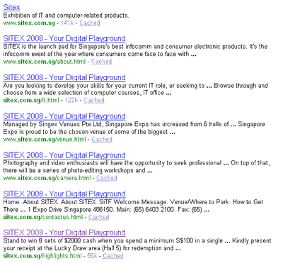
If you look at the indexed pages, you will find that the site has 214 pages… all with the same title!

Like how my SEO mentor loves to put it, imagine your site as a hotel. Having same titles for every page would be equivalent to having every door in the hotel with the same unit number! How do you expect the search engines to categorise and index your content correctly?
My recommendation: Go work on those titles – make them unique to each page!
That’s It!
Yes, so, 5 usability recommendations and 5 SEO recommendations, that I can guarantee will improve their rankings, web traffic and conversions.

My 2 cents.
Sitex’s is already ranked #1 when you search for that term. Changing “home” to “Sitex” doesn’t add any value SEO wise but rather raise confusions for the user (Nobody would assume clicking on Sitex leads to the front page).
Based on eye movement study, the original Sitex site intelligently places the location, date and venue as prime focus on the website but your revision places emphasis on the Sitex logo.
Whilst the original site is not without its flaws, yours just seems too cluttered and unfocused – But you’re spot on in the lazy page title naming. =)
Thanks for your thoughts Myron.
Yes, I’d have to admit my screenshot looks very cluttered… but as mentioned, its a 3 min photoshop job. It looks cluttered because there are too many different colors all around the layout, particularly the reds.
Also yes, putting dates and stuff in the top left does work well, if the middle section is primarily text of one (duller) color. The Digital Playground thing is big and too colorful which I feel is more of a distraction.
Actually if I had more time I’d desaturate some of the elements to bring more attention to the center.
The home link is the first text link on a PR 5 site! That is a lot of very powerful link reputation wasted, considering its 214 indexed pages (of which some are PR 4).
A good solution to this while keeping the usability would be to javascript the link (or link it to a redirected page blocked with robots.txt… or some other means to rid of it from the SE’s interest) so the juice flows better to the other links.
But still, there is a need to get an internal link anchor tags “SITEX” to the web root despite its rankings.
The Ad Sense Ad Placement heatmap is not conclusive.
Most people will notice “Your Digital Playground” because it is BIG, compared to the other elements on the screen.
I agree with you that the freakin icons below “Your Digital Playground” are one of the most irritating navigation ever invented. It is what usability professionals term as the “mystery meat” navigation, where you have to mine-sweep the buttons one by one with your mouse cursor just to find out what they are.
Even worse, subsequent pages contain too little information (just a few items in point form!) and fall short of what users would expect. You don’t make the users work for a simple list of items.
As for your quick 3 min redux, you got it right as in shifting the logo to the left of the page. In this case, users will know what page this is even if their browser window is not maximised. Important info such as time/date is also listed at the top of page in the content area.
However, the information architecture of the site is horrible and could use some massive rework.
Thanks for your thoughts Kaisen,
The Adsense heat map is not conclusive – I’d agree. Of course, the best way to see which works best is for the designers to do a usability test and then do an eye movement study like what Myron described.
Well, if they bothered.
Heh… but anyway, they probably would already have enough computer and electronics fanatics to sardine pack the Singapore Expo halls and make the hotdog, candy floss and popcorn sellers rich!
Good sharing. Anyway I have used to this kind of mistake often happened by many business website 🙂 I think they should go back to study the basic of web design and learn more on usability. 😎